Testing a farmers market sign in Atlanta
Fresh Harvest, an online farmers market in Atlanta, needed a sign for festival booths. We showed 312 local shoppers 93 signs each, built from sixteen headlines, sixteen lines of small print, sixteen strips along the bottom, eight photos and six colours, and asked whether they would stop. The ratings split the crowd into three types of reader, each reacting to a different part of the sign.
in 100 would stop at the best sign for everyone. A sign with nothing much on it scores 50.
types of reader. Each is nearly blind to the parts of the sign the other two read.
the same headline, "Visit our booth for 50% off", scored by two of those readers.
The short version
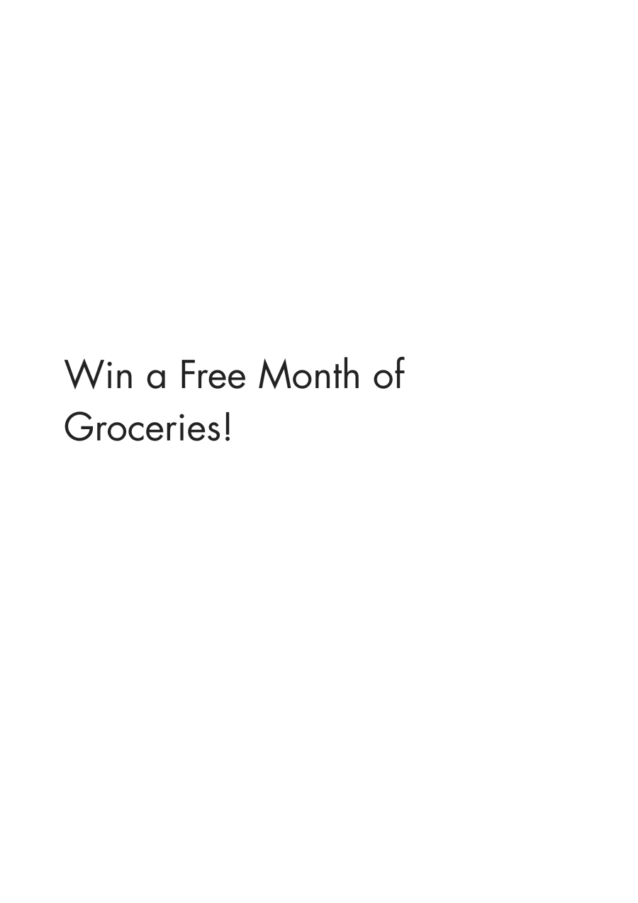
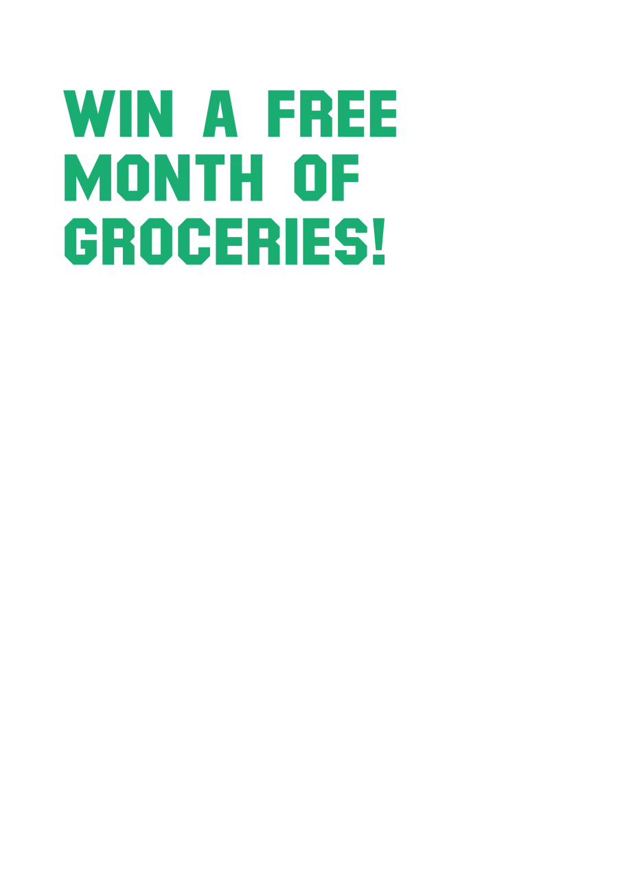
- Lead with an offer. "Visit our booth for 50% off" adds eleven points with everyone and "Win a free month of groceries" ten. No other headline adds more than six.
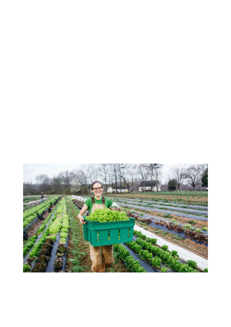
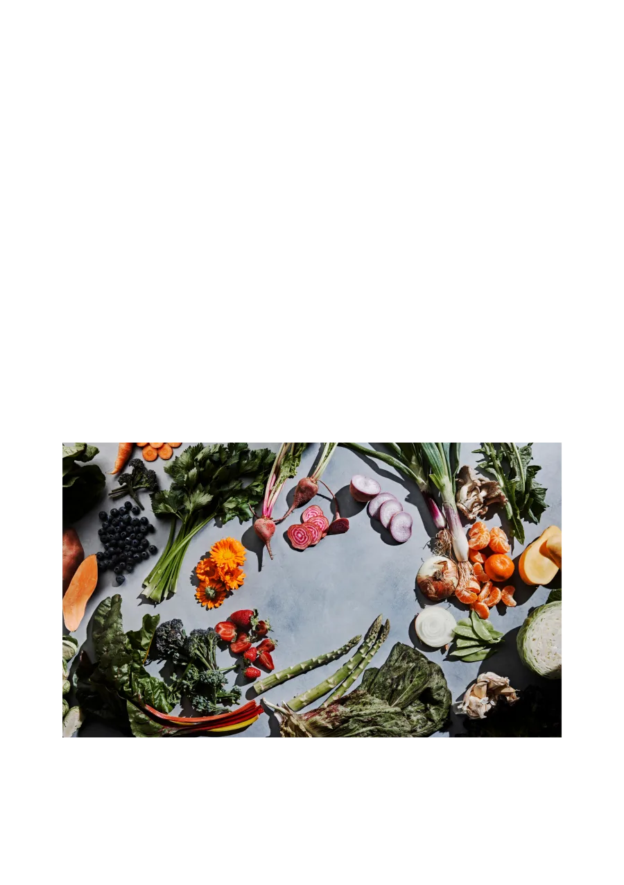
- Show food, not graphics. The farm and produce photos add seven points each. The delivery graphic adds two.
- There are three types of reader. 121 people read the headline, 105 read the small print, 86 read the strip along the bottom. The same headline is worth +25 to the first group and −2 to the second.
- One sign can serve all three. The sign built for everyone scores 86, 80 and 62 with them. Tailored signs would add one, six and five points.
- The signs taught people something false. Three in five came away believing Fresh Harvest charges a subscription fee. It doesn't. That's a job for the small print.
The brief
A sign at a festival booth has one job: make a few of the people walking past stop. Most won't. They glance, and three seconds later they're gone.
Fresh Harvest delivers Georgia-grown groceries across metro Atlanta and had plenty it could say: local, organic, fairly priced, there's a discount, there's a box. That came to sixteen headlines, sixteen lines of small print, sixteen strips along the bottom, eight pictures and six background colours. Any sign is one of each. The team had a favourite, which is the position every team is in.



So we asked one question of everyone who took part. Imagine you are walking through a local outdoor market or festival. How likely are you to stop at a booth after seeing this sign? Five answers, from keep walking to definitely stop.
How it ran
312 people in metro Atlanta took part in August: 209 women and 103 men, 134 living inside the Perimeter and 178 outside it. Two in three go to outdoor festivals a few times a year or more. Fewer than half had heard of Fresh Harvest.
Each person saw 93 complete signs, one after another, and rated every one. The signs were assembled by design, so each part appeared next to every other part about equally often and no two people saw the same set. That's what makes the arithmetic work later. A rating took about three seconds, which is not a flaw. Three seconds is what a sign gets.
Afterwards we work out, for every headline, photo and line of small print, how much it raised or lowered the chance that a person said they would stop. A sign with nothing in particular on it scores 50 in 100, and any sign's score is that 50 plus its parts. Then the same numbers run for every group we can name.
What everyone said
The average is clear, and most teams would stop here.
Offers win. "Visit our booth for 50% off" adds eleven points and "Win a free month of groceries" ten. Every other headline adds between zero and six. Food wins too: the farm and produce photos add seven each, the box, grocery and lifestyle photos six, the graphics two to four. The small print matters less than the headline, though the best line, "Win a free month of groceries!", still adds six. The best bottom strip adds three. The six background colours score within a point of each other. Colour is the designer's call.
Put the best parts together and 78 in 100 would stop. That is a good score, and it is an average. The next section shows what the average hides.
Three readers
Instead of averaging the 312 people, we grouped them by how they behaved. People whose scores rise and fall together belong together. Three groups come out, and they're not about age, gender or postcode. They're about where the eye goes.
121 people read the headline. For them every headline is positive, from +10 to +25. The small print barely registers. The bottom strips are negative, every one, from −4 to −13.
105 people read the small print. For them every headline is zero or worse, down to −13, and the small print carries the sign: "Win a free month of groceries!" is worth +17. The bottom strips help a little.
86 people read the strip along the bottom. For them that strip does the work, +6 to +11. The small print hurts. The headlines are mild.
Each reader sees one layer of the sign and looks through the others. Howard Moskowitz called groups like these mind-sets: people who look at the same thing and see different parts of it. The average blends the three groups into one score that none of them gave.
The sign each reader wants
Build the best sign for each reader from the parts that reader rates highest and you get three different signs. Pick a reader to see theirs.
| Part | Their pick | Adds |
|---|---|---|
| 87 in 100 would stop |
The three signs share one line of small print and not much else, though two share the discount headline. The small-print readers' sign carries "Win a free month of groceries" as its headline, not because they like it (they rate it at zero) but because every other headline costs them points.
Where the readers disagree
Put three parts next to the three readers and the scores point in opposite directions.
"Visit our booth for 50% off" is worth +25 to the headline readers, −2 to the small-print readers and +7 to the bottom-strip readers. "Win a free month of groceries!" as small print is worth +7, +17 and −8. "Seasonal eating made easy" on the bottom strip is worth −10, 0 and +11.
The averages of those three parts are +11, +6 and −1. Averaged, the bottom strip looks irrelevant. Split by reader, it is worth eleven points to one person in four and costs ten with nearly two in five, which makes it the most important part of the sign for the first group and a liability for the second.
Women and men
Men respond to headlines. Almost every headline moves men between +6 and +13. Most move women by a point or less. "Guess the price of our box to win" moves men 13 points and women 2.
Women respond to the offer and the food. "Visit our booth for 50% off" moves women 12 points, more than any other headline does with women. The produce photo moves women 8 points and men 4. The grocery photo does the reverse: men 9, women 4.
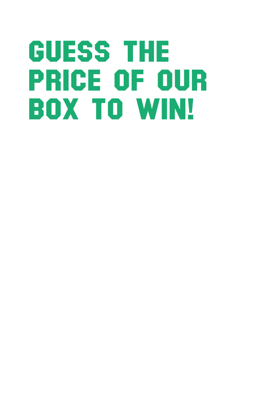
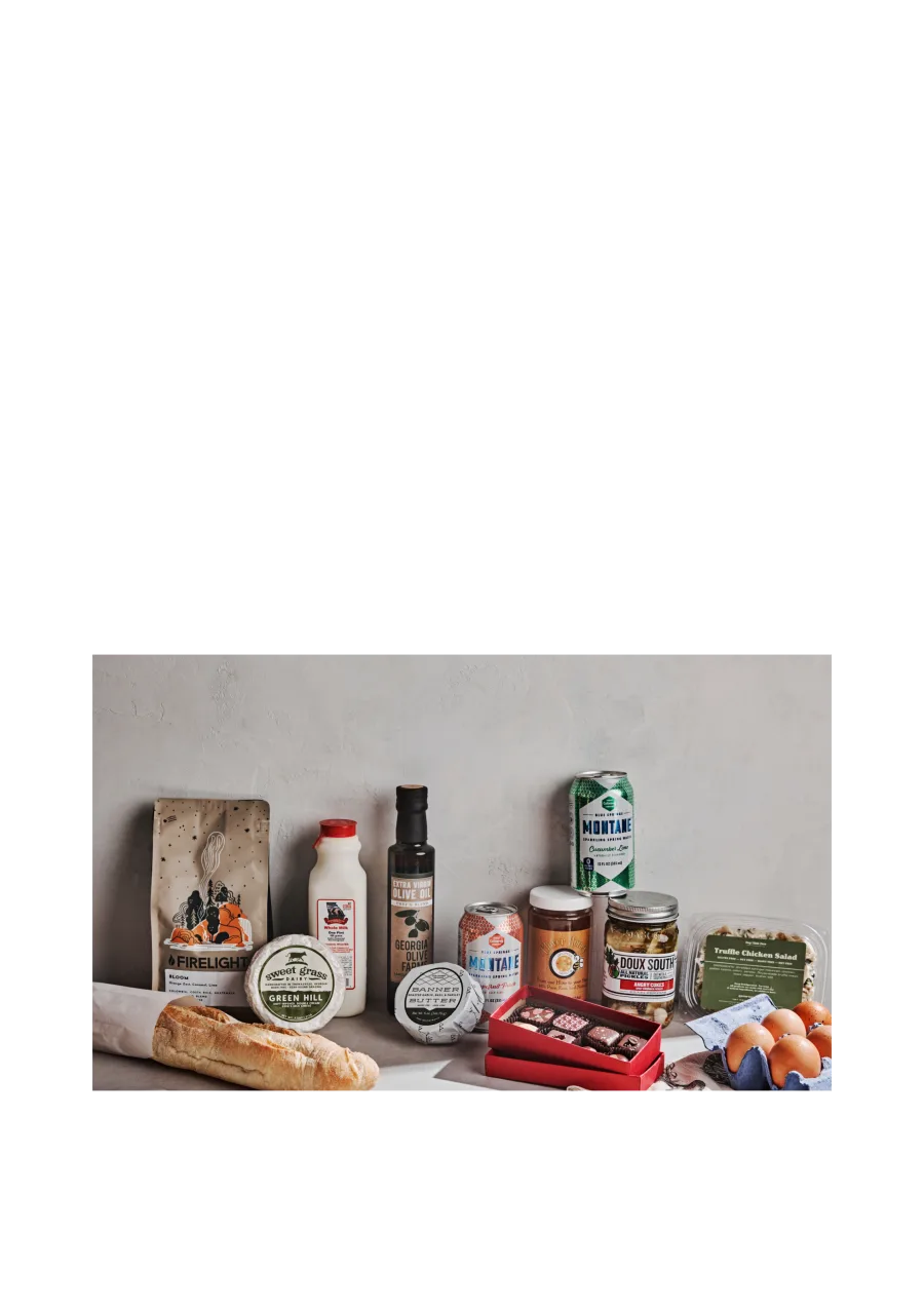
Two signs come out of that. The best sign for women, with the discount headline and the produce photo, scores 82 with women. The best sign for men, with the guessing game and the grocery photo, scores 83 with men.
Age
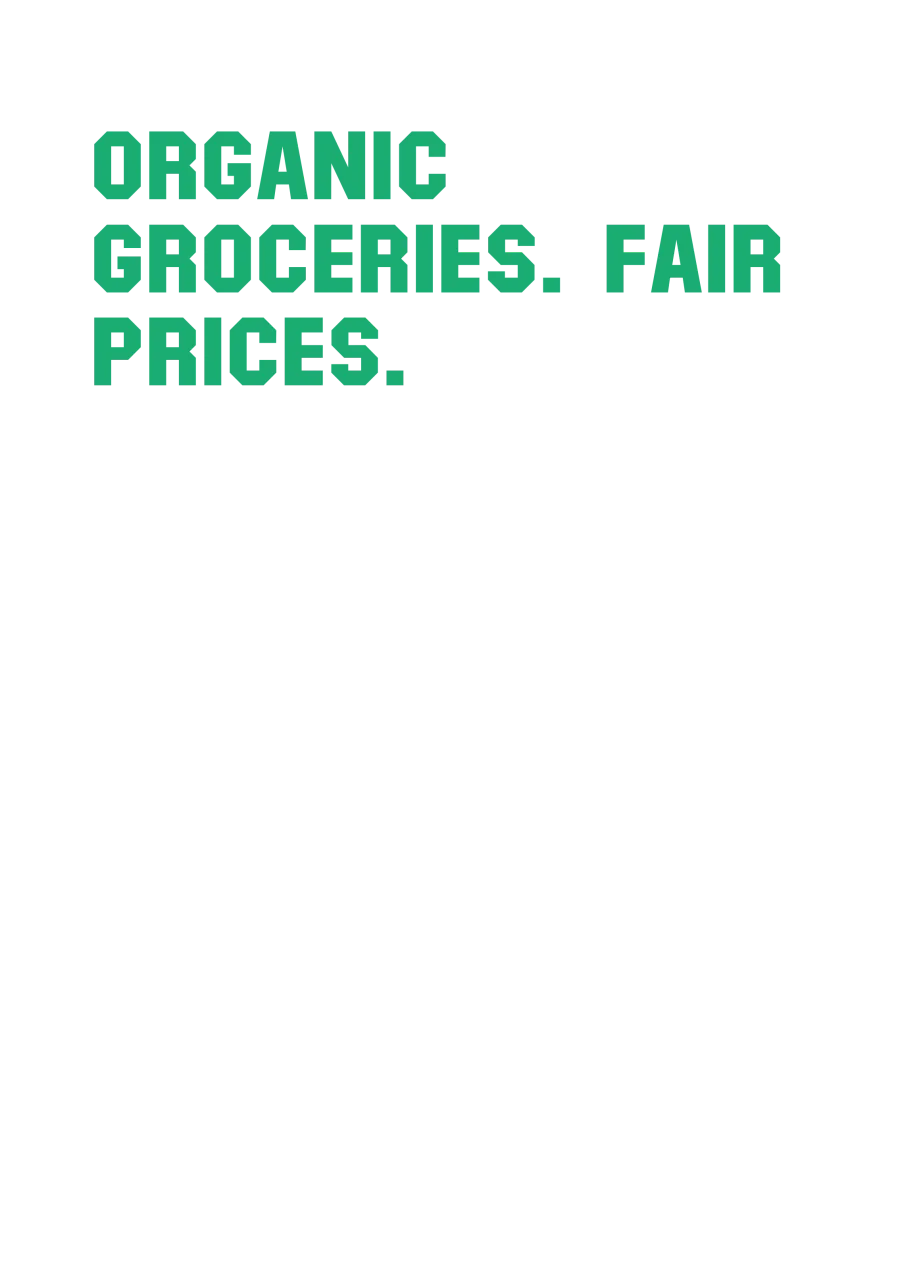
Some parts flip with age. "Organic groceries, fair prices" adds seven points with people aged 35 to 54 and takes ten away with people aged 55 to 64. "Prefer big grocery chains? Keep walking" adds six with people aged 35 to 44 and costs eight with people aged 55 to 64.
Others grow with age. "Win a free month of groceries" adds two points with people aged 25 to 34 and twenty with people aged 45 to 54. The best sign for that group scores 94, the highest of any sign with any group in the study.
What the signs taught
After the ratings we asked people what they now believed about Fresh Harvest. The signs had taught them things, some of them wrong.
189 of 312 believed Fresh Harvest charges a subscription fee. It doesn't. 266 believed every order can be customised. 158 believed it's a big national brand and 154 didn't, which is as even as a split gets. Asked what Fresh Harvest is, 129 said an online farmers market with home delivery, 106 said a local grocery store or farmers market, and 57 said a weekly produce box from one farm.
A sign has two jobs. The headline stops people. The small print tells them what they stopped for. Here the small print was chosen to lift the score, and it did, but it never said there's no fee, so three in five people assumed there was one.
The decision
Three readers don't need three signs. The sign built for everyone carries a strong headline for the headline readers, strong small print for the small-print readers, and a bottom strip the third group can accept. With them it scores 86, 80 and 62. Signs tailored to each would score 87, 86 and 67. One, six and five points aren't worth three signs.
Women and men, and the ages, are a different kind of split. Fresh Harvest went with a sign for each audience, built from the parts that audience rated highest, with colour left to the designer. Every one of those signs follows the three-reader rule anyway: a headline the headline readers like, small print the small-print readers like, a bottom strip that does no harm.
What each still needs is a line of small print with a second job. Five words: there is no subscription fee.
In our manifesto this is the second of three answers to a split crowd: give each group its part on one object. The pack study put two designs' winning parts together. The logo study picked one group.
Send us the sign.
Or the pack, the logo, the name, the price. We'll design the study around it, put it in front of the right people, and show you who reads what.
Notes and references
- Fieldwork: metro Atlanta, August 2026. 312 people, 29,016 ratings, 93 signs each. Five-point scale; a score is the number of people in 100 who answer 4 or 5, worked out by regression, with a blank sign at 50. Part scores are rounded to whole points, so the parts of a sign may not sum exactly to its score.
- The three types of reader come from clustering people on their part scores. Group sizes: 121, 105, 86.
- Moskowitz, H. R., & Gofman, A. (2007). Selling Blue Elephants. Wharton School Publishing.
- Krantz, D. H., Luce, R. D., Suppes, P., & Tversky, A. (1971). Foundations of Measurement, Vol. I. Academic Press.
- Stevens, S. S. (1957). On the psychophysical law. Psychological Review, 64(3), 153–181.
- MindSurf (2026). How we measure what people will choose